I have created my infographic resume.
You can find it here:
https://docs.google.com/file/d/0B2EvqD_BfBNgOUxvTS1QT2VGMG8/edit
I decided to incorporate my experience, education, certifications, and technical skills into this infographic resume. I used Microsoft Publisher to create the infographic resume. I wanted my resume to be easy to understand and highlight certain criteria. Hope you enjoy and let me know any changes that can be made to improve it!
Sunday, April 22, 2012
Friday, April 20, 2012
Monetizing Social Media
I think that monetizing Social Media is the only way to be able to capture the network effect, while still having a profitable business. Social Media such as Facebook needs to be used by many users to make other people want to use it. If Facebook was not free, the adoption rate would be much less than it currently is. You would not want to pay to try Facebook when you did not even know if you liked it or not. By using the advertising revenue model, Facebook captures revenue based directly on the number of the users on their website. It is a good revenue model to be able to monetize this form of social media, without requiring the users to a premium for their service. I am more comfortable with seeing advertisements on my Facebook page rather than having to pay for the use of the website.
In terms of monetizing Social Media for the social media owners, I think that there are other routes instead of advertising. One of the routes could be a freemium/premium account system where users can pay a premium to access additional features and no advertisements, but other uses can use the free service while still having advertisements. This could be done so that people have the option to remove advertisements from their viewing.
Monetizing Social media can also be done by being able to create person profiles to have ultimate recommendations for them. This seems to have privacy concerns, but most social media websites are already collecting enormous amounts of data on each user. If they can sell this data, it may be worthwhile to continue collecting the data.
Another important aspect that we need to consider is how can people and businesses monetize social media? Apart from advertisements on their websites, another important way to monetize social media is to build strong relationships with clients and users. Creating fan pages can be a useful way to stay in touch with fans and help to lead to purchase sin the future. This is directly relevant to creating brand awareness and customer loyalty. These are very important aspects for a business to remain healthy. The business can end up increasing traffic and sales by using social media effectively, which therefore would monetize social media. This would definitely be worthwhile since you are investing little time and effort in social media to greatly increase the brand loyalty and awareness.
Audience engagement is key when using social media as a means of transferring new product information. The audience should be greatly enthused about the products that you have to offer so that you can have better sales and promotions. Some of the ways to increase audience engagement is to provide content specific to the audience you are targeting. With the correct content, the audience is more engaged and eager to learn more about the products in the future. You can also try to engage the audience with different promotions that are targeted for that company. I think that audience engagement would be worthwhile also since you would have a loyal following of customers.
Another great way to attract people to your business is to build applications or apps for users to use. This allows them to be able to easily go to your Facebook page or blog to learn more about the business. It does cost money to build these apps, but it is a worthwhile investment if you can retrieve additional customers.
Monetizing Social Media seems to be the next big thing in terms of the online world. There have been many different phases of the Internet, and social media seems to be here to stay. It is very important for companies to be able to monetize social media, and for social media to earn the revenue it needs.
Thursday, April 19, 2012
Balanced Scorecards
Balanced Scorecards are a very important way for businesses to understand how they are doing at different processes and procedures. As we learned in class, companies need to create scorecards that can measure their performance.
Southwest Airlines was one of the primary examples that we discussed in class. They had a very useful balanced scorecard where they had separate functions that they rated and wanted to see performance on.
A balanced scorecard is built to align a businesses activities with the vision of the company. It allows the company to determine how they are doing and gives them an idea on how to fix problem areas. Here is an example of a balanced dashboard:

Source: http://www.balancedscorecard.org/Portals/0/images/balancedscorecard.jpg
The above figure shows four different perspectives including financial, customer, learning and growth, and internal business processes. Each has a specific focus and is rated on different criteria. The company needs to determine how to rate the specific process.
To learn more about balanced scorecards, visit the following link:
http://www.balancedscorecard.org/BSCResources/AbouttheBalancedScorecard/tabid/55/Default.aspx
Saturday, April 14, 2012
GOMC Presentations
This week we had our Google Online Marketing Challenge presentations. It was very interesting to be able to watch all the presentations from various groups. Different groups were using various techniques and strategies throughout the campaign that showed me that there were multiple ways to use the Google 250$ for the campaigns.
One of the most interesting ideas that I had not thought about before was that certain clicks can be worth more than others. For example, the Honey Badgers team had good results with total conversions, but it was very impressive that two of their clicks made the clients very happy. One of the clicks helped the organization by setting up an interview with a today show. This click was worth way more than the total Google campaign cost for the client.
Another thing that I learned from the judges was that it was very important to have a slide that clearly states what the pre campaign goals were vs the post campaign results. I think this is a good practice to have in any presentation since it lets the audience know exactly what happened during the campaign. Several of the teams had slides like these and I think it could have helped our presentation.
The judges also illustrated that it was very important to know what the client wants from the campaign. It is not important to only know about the CTR, CPC, and other Google Adwords metrics, but it is important to understand how these metrics help the organization.
Return on Investment seemed to be a very integral part in determining if the Adwords campaign should be used in the future. For profit companies was much easier to determine the ROI since they know exactly how much they earn per sale. The non profits need to do more estimating to have a better understanding of the return on investment.
The GOMC was a very useful exercise that helped improve many skills including project management, client interaction, and new tools. Google Adwords and Google Analytics were useful tools to learn to understand more about online marketing.
Wednesday, April 4, 2012
OBIEE
Oracle Business Intelligence Enterprise Edition is a very important part for most organizations to generate business intelligence from their data. I have had hands on experience with SQL server and Oracle and I have noticed that most small to mid size companies use SQL Server whereas larger companies push for Oracle or Teradata. Oracle is a very scalabe and robust database management system that can be the back end for many large applications, such as SAP.
Some of the benefits of OBIEE include:
Oracle's analytics are one of the most important parts of OBIEE. It allows users to quickly analyze data if the correct data warehouse is created. Dashboards and reports are viewed on a web browser rather than an application. This is a unique advantage that OBIEE has over some of its competitors. I have used Oracle 11g and this version has the ability to pivot on the browser. Pivoting on the browser is an awesome feature that should not be overlooked. Many users have asked for this feature for many years but it has not been a plausible solution due to the overhead, but Oracle has been able to create a strong infrastructure to make it possible.
 Source: http://obieeblog.files.wordpress.com/2009/01/011209-1851-obieeonwind81.png

Some of the benefits of OBIEE include:
- Comprehensive BI functionality built on a unified infrastructure- This reduces cost and increases productivity
- Powerful User experience - OBIEE has a task oriented navigation framework
- Unified business model
- Hot-pluggable - integrate with all popular ETL tools, databases, and applications
- Best-in class scalability, reliability, and performance
Oracle's analytics are one of the most important parts of OBIEE. It allows users to quickly analyze data if the correct data warehouse is created. Dashboards and reports are viewed on a web browser rather than an application. This is a unique advantage that OBIEE has over some of its competitors. I have used Oracle 11g and this version has the ability to pivot on the browser. Pivoting on the browser is an awesome feature that should not be overlooked. Many users have asked for this feature for many years but it has not been a plausible solution due to the overhead, but Oracle has been able to create a strong infrastructure to make it possible.


Source: http://www.oramoss.com/images/blogposts/ORCL_to_TEST_AllWorking.jpg
These are some sample images of the websites for Oracle OBIEE. University of Arizona recently upgraded from Oracle 10g to 11g.
Saturday, March 24, 2012
Dimensional Modeling is an important part when attempting to create business intelligence out of pure data. In order to understand dimensional modeling, we first need to differentiate the difference between OLAP and OLTP. OLAP is online analytical processing, and is used for analysis. OLAP needs to have more historical information so that you can understand trends and prior data. OLTP is online transaction processing where you record information and insert it into databases. OLTP has a lot of data manipulation in terms of updating, inserting, and deleting rows in databases. On the other hand OLAP only needs read access to the data since there is not manipulation in OLAP.
Below is an image to describe the difference visually:
 Source: http://datawarehouse4u.info/OLTP-vs-OLAP.html
Another key difference that this article mentions is that OLTP has a more normalized database structure, whereas OLAP will have less normalized relations. This brings us to dimensional modeling with various types of schema.
Star Schema requires fact tables and dimension tables. A dimension can categorize data so that users can interact with the data warehouse in different ways. Dimensions are typically small with not too many rows. A fact table is created by having measures or numberic facts that want to be analyzed, and multiple foreign keys to connect to the various dimensions. Fact tables will continue growing and can be very large, which will make processing time longer.
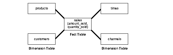 Source: http://oracle-online-help.blogspot.com/2006/11/star-vs-snowflake-schema.html
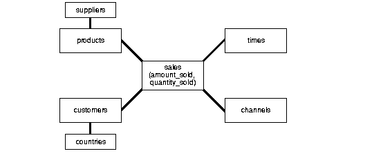
Snowflake schema is a more complex version of a Star schema where the dimensions are more normalized. Fact tables connect to the dimensions similarly to star schema, but then they can also connect to dimensions through dimensions, which can be defined through various relationships.
 Source: http://datawarehouse4u.info/OLTP-vs-OLAP.html
Data warehouses can use a hybrid approach of star and snowflake schema if they want to normalize only certain dimensions. This can be beneficial so that the structure is not too complex, but allows the user to do the necessary analysis.
As illustrated, dimensional modeling is an important part of data warehousing and the schema defines the structure. Analysis is much better with a correct data warehouse instead of using the database structures to perform similar analysis. I have been using SQL Server 2005/2008 to develop data warehouses and specific cubes. I am currently looking into SQL 2012 to see the additional features and functionality that it offers.
Below is an image to describe the difference visually:

Another key difference that this article mentions is that OLTP has a more normalized database structure, whereas OLAP will have less normalized relations. This brings us to dimensional modeling with various types of schema.
Star Schema requires fact tables and dimension tables. A dimension can categorize data so that users can interact with the data warehouse in different ways. Dimensions are typically small with not too many rows. A fact table is created by having measures or numberic facts that want to be analyzed, and multiple foreign keys to connect to the various dimensions. Fact tables will continue growing and can be very large, which will make processing time longer.

Snowflake schema is a more complex version of a Star schema where the dimensions are more normalized. Fact tables connect to the dimensions similarly to star schema, but then they can also connect to dimensions through dimensions, which can be defined through various relationships.

Data warehouses can use a hybrid approach of star and snowflake schema if they want to normalize only certain dimensions. This can be beneficial so that the structure is not too complex, but allows the user to do the necessary analysis.
As illustrated, dimensional modeling is an important part of data warehousing and the schema defines the structure. Analysis is much better with a correct data warehouse instead of using the database structures to perform similar analysis. I have been using SQL Server 2005/2008 to develop data warehouses and specific cubes. I am currently looking into SQL 2012 to see the additional features and functionality that it offers.
Tuesday, March 20, 2012
This week in Business Intelligence we had an introduction to understanding the necessary steps to get to dashboards, reports, and various analytics. Cleaning the data is a very time consuming component of data warehousing, but you need to have clean data in order to have useful analysis. Giving bad recommendations due to bad data will not be useful.
We were tasked with using Ataqamma to perform data profiling. However, there are many tools out there, such as Informatica's data profiling tool. More information can be found here:
http://www.informatica.com/us/data-profiling/
The slogan that they use is: "Increase Confidence in Your Enterprise Data with Informatica Data Profiling Solutions"
Data profiling is when you try to understand the data in various tables or sources to have a better understanding of the data characteristics. Some of the primary findings that I had were the different formats that people enter when there are no constraints, and null values. These problems need to be addressed for the future inputs, and corrected immediately for the past inputs before proceeding with the business intelligence motive.
Extract, transform, and load is an important part that takes source data, makes the necessary transformations and adjustments, and loads it to a database. Here is a general picture:
ETL is a very important part to ensure that you can do the proper analysis. Once the data has been loaded, we can use different ways of analyzing the data. The key findings are found in the analysis stage, but this is a minor time requirement in the overall process. Analyzing dirty data will lead to incorrect decisions, and may be worse than any business intelligence at all.
Saturday, March 3, 2012
Network Graph Properties
Business Intelligence class continued the discussion on Network analysis and properties of a network graph. There are many properties of a network that we want to analyze in order to understand the network and compare it with other networks. Structural properties are very important for this analysis.
Degree centrality is the number of links or proportion of links that a particular node has. The degree can be an in degree or an out degree. The degree is usually expressed as a number between 0 and 1. Degree centrality is the number of links that the node has divided by the total number of nodes and subtracting one. Below is an example to calculate this:

Source: http://www.sscnet.ucla.edu/soc/faculty/mcfarland/soc112/cent-ans.htm
Another important feature is the closeness centrality. This describes how close a particular node is to another node based on the shortest path. It basically says how fast you can reach someone when starting at an arbitrary node. Some of the areas it works for is information diffusion or disease transmission. Below is an example of how this is calculated:

Source: http://www.sscnet.ucla.edu/soc/faculty/mcfarland/soc112/cent-ans.htm
Eigenvector Centrality is another important characteristic that we can use to analyze. The Eigenvector centrality takes into account a different measure of importance. If a node is connected to many other nodes, then the node is very important, which is what Google's PageRank uses for webpages. A node does not have importance on its own, but it comes from being connected to other nodes that are connected to other nodes. This is useful because it can tell you how many people can this node reach directly and how well connected the person is.
Gephi will be used throughout this course to visualize the graphs. I was able to use Gephi for the upcoming assignment to analyze my facebook friends to see how everything is interrelated.
Below is my Facebook network built with Gephi and Netvizz app with ranking it by Degree.

Degree centrality is the number of links or proportion of links that a particular node has. The degree can be an in degree or an out degree. The degree is usually expressed as a number between 0 and 1. Degree centrality is the number of links that the node has divided by the total number of nodes and subtracting one. Below is an example to calculate this:
Source: http://www.sscnet.ucla.edu/soc/faculty/mcfarland/soc112/cent-ans.htm
Another important feature is the closeness centrality. This describes how close a particular node is to another node based on the shortest path. It basically says how fast you can reach someone when starting at an arbitrary node. Some of the areas it works for is information diffusion or disease transmission. Below is an example of how this is calculated:

Source: http://www.sscnet.ucla.edu/soc/faculty/mcfarland/soc112/cent-ans.htm
Eigenvector Centrality is another important characteristic that we can use to analyze. The Eigenvector centrality takes into account a different measure of importance. If a node is connected to many other nodes, then the node is very important, which is what Google's PageRank uses for webpages. A node does not have importance on its own, but it comes from being connected to other nodes that are connected to other nodes. This is useful because it can tell you how many people can this node reach directly and how well connected the person is.
Gephi will be used throughout this course to visualize the graphs. I was able to use Gephi for the upcoming assignment to analyze my facebook friends to see how everything is interrelated.
Below is my Facebook network built with Gephi and Netvizz app with ranking it by Degree.

Thursday, February 23, 2012
Network graphs were first developed in the 18th century in order to solve a problem about 7 bridges in a town called Konigsburg. The problem was developing a route to cross over every bridge at least once, and it had many issues to solve. Leonard Euler envisioned this problem as a network with 4 nodes that are all connected to each other. This link has more details regarding the initial discovery of networks:
http://www.jcu.edu/math/vignettes/bridges.htm
The original network problem looked similar to this:
 There are a lot of interesting aspects to a network graph including odd and even vertices. An odd vertex has an odd number of links. An even vertex has an even number of links. In addition to vertices, graphs also have edges. Edges connect nodes together. There is a lot of mathematics behind the network graphs including the edge and vertex concepts.
Network graphs can be also used to understand sequences. One interesting fact that we learned was the idea of 6 degrees of separation. A degree can apply to individual nodes or groups. I was skeptical at first when I heard this theory. The theory basically states that you can connect to anyone in the world with an average of 6 degrees of separation. In an interesting article, Microsoft proves that the six degrees of separation is valid. Source: http://www.guardian.co.uk/technology/2008/aug/03/internet.email
Microsoft decided to test this by using 30 billion electronic messages. It seems that using a social media network can also prove this topic. We are continuously becoming more interconnected with each other regardless of physical location. Facebook, twitter, and LinkedIn are allowing us to maintain connections that we would not have otherwise. It is important to be able to visualize these networks to make more sense. Below is an example of a LinkedIn network graph:
 This image helps to paint a picture of how one person is connected with all of their connections. LinkedIn is able to do this by using the data when making connections with other people. I think it is a very useful tool.
http://www.jcu.edu/math/vignettes/bridges.htm
The original network problem looked similar to this:

Network graphs can be also used to understand sequences. One interesting fact that we learned was the idea of 6 degrees of separation. A degree can apply to individual nodes or groups. I was skeptical at first when I heard this theory. The theory basically states that you can connect to anyone in the world with an average of 6 degrees of separation. In an interesting article, Microsoft proves that the six degrees of separation is valid. Source: http://www.guardian.co.uk/technology/2008/aug/03/internet.email
Microsoft decided to test this by using 30 billion electronic messages. It seems that using a social media network can also prove this topic. We are continuously becoming more interconnected with each other regardless of physical location. Facebook, twitter, and LinkedIn are allowing us to maintain connections that we would not have otherwise. It is important to be able to visualize these networks to make more sense. Below is an example of a LinkedIn network graph:

Saturday, February 18, 2012
This week in Business Intelligence class we learned more about conversion rates that we should implement in our Google Adwords challenge. It is important to increase pageviews during the challenge, but one of the most important things is having conversions. One way that the professor suggested was to count the pageviews that occur after the registration page, which is usually a thank you page. This seems like an important way to see if the pageviews were worthwhile or else it was not worth the cost to advertise.
The other lecture this week involved a guest lecturer from an up and coming company called SocialFlow. More information about this company can be found here:
http://www.socialflow.com/
Gilad showed us how the company uses Twitter and other tools such as Gephi and Python code to visualize this information. An example of a Gephi graph is shown below:

Source: https://blogger.googleusercontent.com/img/b/R29vZ2xl/AVvXsEg2BSQkCU0cfmh4MxrHSuTuvkBTf9nKnNFvPlcuGPdSSjPtc0TeCzsfx5QMFulu6jWRb5w6R5o8H1qbNJMFPfF4NTgFhb0Kf51zm_Q6F75AK7zw-bIASyDtBwyM0p26Wv9L3VIjSEMk0PH6/s1600/gephi+sna.PNG
Graphs like these can be very useful for organizations that are trying to find out the type of people that are talking about their company. It can also help to understand where a Twitter tweet originated and how it progressed from there. Gilad showed us an example tweet where it moved from the original poster until it went viral.This is really cool since it can help to understand the origination of a tweet and what made it take off. For example, Gilad was saying that the tweets continued at a slow pace until a large follower tweeted with the hashtag, and then it started to take off. Twitter requires a large celebrity that is followed by many people to start the viral process.
In this class, we will need to create similar graphs, which should be interesting to learn more about. Sudha and Gilad informed us that data cleansing is one of the more time consuming parts, but is very important to have useful information derived from the data. I would like to learn more about how the information is being retrieved and stored.
Friday, February 10, 2012
This week in Business Intelligence class, we learned about Google and how it decides on which pages to display first. This is a very interesting topic since there are not many people that will continue past the first page when they are searching something. Due to this fact, if you are a website owner, it is very important to have your page on the initial result set.
According to Google, page rank is defined as follows:
"PageRank relies on the uniquely democratic nature of the web by using its vast link structure as an indicator of an individual page’s value. In essence, Google interprets a link from page A to page B as a vote, by page A, for page B. But, Google looks at considerably more than the sheer volume of votes, or links a page receives; for example, it also analyzes the page that casts the vote. Votes cast by pages that are themselves “important” weigh more heavily and help to make other pages “important.” Using these and other factors, Google provides its views on pages’ relative importance."
Source: http://searchengineland.com/what-is-google-pagerank-a-guide-for-searchers-webmasters-11068
Google has a page rank website that will rank any website that you enter. Since page ranking is very important for websites, the website owners will try to increase their page rank anyway possible. For example, websites may add keywords in white text to try to have higher page views from Google when keywords are searched. There is a war going on with websites in order to remain on the first page of results from a Google Search.
In addition to page ranking, Google uses Ad Rank to rank advertisements that will be shown based on search criteria. The ad rank score is calculated based on two factors, which are Cost per click, and the Quality score. It is more important to have a strong quality score than paying a high cost per click for the advertisers since they want to earn profits. The quality score is measured based on relevance to the search topic.
Source: http://support.google.com/adwords/bin/answer.py?hl=en&answer=1722122&from=6111&rd=1
Here is a video that describes the Quality Score in depth:
Friday, February 3, 2012
Google Analytics
The first and second homework assignments gave us an in depth understanding of how Google Analytics can be used to increase Business Intelligence. The various analytical abilities that GA has installed allows us to create recommendations that are meaningful and useful.
In addition, Google Analytics can be used to help increase sales. Additional information can be found here:
http://www.comparebi.com/increasing-sales-with-google-analytics/
Different parts of Google Analytics such as sources, keywords, demographics, and page sequence can help to increase sales. For example, you can have more people land on your website if you use specific keywords. This can help people learn more about your website and increase overall traffic. In addition, you can target specific sources to try to increase the presence on your website. Once you know where the top traffic is coming from, you can continue to develop these sources and/or develop other sources to increase overall traffic.
Another important part that Google Analytics offers is the ability to find the top content and top pages that are being viewed. This can be very useful if you want to redesign your website. You want people to reach certain pages, so it would be useful to have an easy navigation throughout.
Also, bounce rate is an important statistic that Google Analytics offers. It helps to show the pages that people leave your website. Through analysis, you can create an hypothesis to reason why people are leaving the website at this point. If you can fix these issues, you will have higher page views.
This week in Business Intelligence class, we learned about the use of network graphs and how they play a vital role in Business Intelligence. The LinkedIn example is a good way to show how people are related to you.
One of the tools that I have exposure to is NodeXL when it comes to generating network graphs. More information about NodeXL can be found here:
http://cwebbbi.wordpress.com/2010/02/22/nodexl-network-graphs-and-the-eurovision-song-contest/
According to Chris Webb, NodeXL and network graphs in general are: "Basically a tool for displaying and analysing network graphs. That sounds a lot more complicated than it actually is – really all it means is that you can use it for analysing the relationships between things"
Network graphs can be useful for understanding how to group different people into a section. It is very useful when you want to understand how things are related to one another, and to have different groupings. Here is a picture of a typical network graph:

When I have used NodeXL, it has been primarily for understanding the different social media users or sources that are talking about a specific topic. This is useful for businesses to know where they are being talked about on the Internet, and if there are any relations with this.
Social Media networks seem to be the most interesting to see how things are interrelated. Facebook and LinkedIn both have nice tools to map this for you.
One of the tools that I have exposure to is NodeXL when it comes to generating network graphs. More information about NodeXL can be found here:
http://cwebbbi.wordpress.com/2010/02/22/nodexl-network-graphs-and-the-eurovision-song-contest/
According to Chris Webb, NodeXL and network graphs in general are: "Basically a tool for displaying and analysing network graphs. That sounds a lot more complicated than it actually is – really all it means is that you can use it for analysing the relationships between things"
Network graphs can be useful for understanding how to group different people into a section. It is very useful when you want to understand how things are related to one another, and to have different groupings. Here is a picture of a typical network graph:
When I have used NodeXL, it has been primarily for understanding the different social media users or sources that are talking about a specific topic. This is useful for businesses to know where they are being talked about on the Internet, and if there are any relations with this.
Social Media networks seem to be the most interesting to see how things are interrelated. Facebook and LinkedIn both have nice tools to map this for you.
Wednesday, January 25, 2012
In class this week, we had a detailed discussion regarding metrics vs KPIs. This is very important to understand the difference in business intelligence to understand what to show managers in your dashboards, reports, and other business intelligence analytics.
According to http://itsm.certification.info/metrics.html,
"A metric is any standard of measurement - number of incidents logged, average time to log incident, percentage incidents resolved within agreed service level etc.
A Key Performance Indicator (KPI) is a metric that you have chosen that will give an indication of your performance and can be used as a driver for improvement. In general it's preferred to just chose a few KPIs (say 3 or 4) to focus on.
The point is this: a metric is just a measurement. A KPI is an indicator
(a metric) that you have chosen, and agreed with your partners (whether
internal to IT or with customers), that will determine whether you are
meeting your critical success factors (CSF)."
Based on these definitions and the ones discussed in class, metrics are numerical numbers and KPIs use the metrics to measure the overall performance of the company at that given time. I have used KPIs in my career with SQL Server 2008 and they have been an important part of any report or dashboard that will be targeted towards Upper management. These KPIs will give them an understanding of whether or not everything is performing well. If there is a problem, they can perform data analysis in cubes, pivot tables, or other tools to drill down into the data better.
Below is an example of an executive dashboard that shows top level managers the current performance. In this specific dashboard, there are multiple gauges. I think gauges have their place in dashboards, but it seems like this dashboard overuses the amount of gauges to put on one page, but that is not too important. I think that the color scheme is very useful to let managers know immediately where there are problems at. The red, green, and yellow scheme does not require a legend to understand.

According to http://itsm.certification.info/metrics.html,
"A metric is any standard of measurement - number of incidents logged, average time to log incident, percentage incidents resolved within agreed service level etc.
A Key Performance Indicator (KPI) is a metric that you have chosen that will give an indication of your performance and can be used as a driver for improvement. In general it's preferred to just chose a few KPIs (say 3 or 4) to focus on.
Based on these definitions and the ones discussed in class, metrics are numerical numbers and KPIs use the metrics to measure the overall performance of the company at that given time. I have used KPIs in my career with SQL Server 2008 and they have been an important part of any report or dashboard that will be targeted towards Upper management. These KPIs will give them an understanding of whether or not everything is performing well. If there is a problem, they can perform data analysis in cubes, pivot tables, or other tools to drill down into the data better.
Below is an example of an executive dashboard that shows top level managers the current performance. In this specific dashboard, there are multiple gauges. I think gauges have their place in dashboards, but it seems like this dashboard overuses the amount of gauges to put on one page, but that is not too important. I think that the color scheme is very useful to let managers know immediately where there are problems at. The red, green, and yellow scheme does not require a legend to understand.

Source: http://www.dashboardspy.com/img/hospital-executive-dashboard-kpi.jpg
I am very interested in continuing to learn, develop, and deploy dashboards, reports, and analytical tools in my business intelligence career.
Monday, January 16, 2012
The MIS 587 Business Intelligence course seems very interesting and important for my future career. I have currently been working with SQL Server 2008. I am looking forward to learning more about Data warehousing with Terradata, since I have not used this tool before, and using Social Media to influence business decisions.
Since my concentration will be in BI, I decided to do some research to understand what business intelligence consists of. According to Wikipedia:
"Business intelligence (BI) mainly refers to computer-based techniques used in identifying, extracting,[clarification needed] and analyzing business data, such as sales revenue by products and/or departments, or by associated costs and incomes.[1]
BI technologies provide historical, current and predictive views of business operations. Common functions of business intelligence technologies are reporting, online analytical processing, analytics, data mining, process mining, complex event processing, business performance management, benchmarking, text mining and predictive analytics."
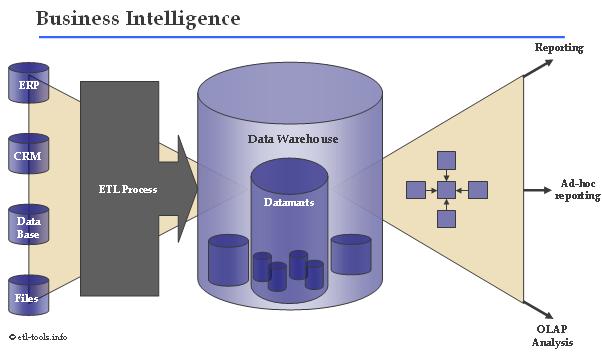
Based on this definition, data is the primary component that is needed to drive business intelligence. I have worked on many projects that use the ETL (extract, transform, load) procedure to create various databases or data warehouses. Below is an image that illustrates the ETL procedure along with how to create Business intelligence from it.

From this course, I am hoping to add new tools and procedures to my skill set so that I can use business intelligence to help a future company.
Since my concentration will be in BI, I decided to do some research to understand what business intelligence consists of. According to Wikipedia:
"Business intelligence (BI) mainly refers to computer-based techniques used in identifying, extracting,[clarification needed] and analyzing business data, such as sales revenue by products and/or departments, or by associated costs and incomes.[1]
BI technologies provide historical, current and predictive views of business operations. Common functions of business intelligence technologies are reporting, online analytical processing, analytics, data mining, process mining, complex event processing, business performance management, benchmarking, text mining and predictive analytics."
Based on this definition, data is the primary component that is needed to drive business intelligence. I have worked on many projects that use the ETL (extract, transform, load) procedure to create various databases or data warehouses. Below is an image that illustrates the ETL procedure along with how to create Business intelligence from it.

Source: http://www.avanco.com/sol_business_intel.html
From this course, I am hoping to add new tools and procedures to my skill set so that I can use business intelligence to help a future company.
Subscribe to:
Comments (Atom)